Visualising Venezuela-Brazil Border Scenarios
In this visualization, we illustrate what might happen under different scenarios and certain assumptions.
With this tool, you can vary several parameters related to rates of border crossing and relocation and view the results of a 'queuing model' simulation based on those parameters.
Model assumptions:
In this model, there are a few key assumptions:
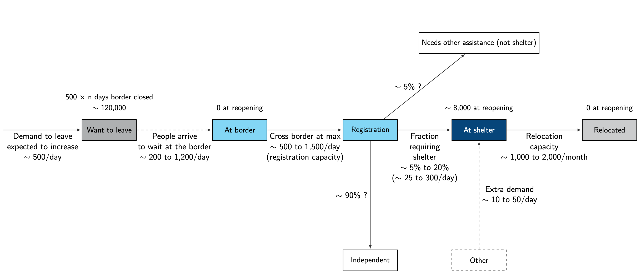
- People arrive at the border a steady rate (arrivals_to_border: 200-1200 people per day).
- Each day, those same people pass through the border, capped by a border registration capacity (border_capacity: 500-1500 people/day).
- Of the people who pass through the border, a fraction (5-20%) head to abrigos, where they stay until they are relocated. In addition to this, a certain number of people (extra_demand: 10-50 people/day) also head to abrigos.
- Once a month, people in the abrigos are relocated to other parts of the country, with a cap of some monthly relocation capacity (relocation_capacity_monthly: 1000-2000 people/month).
- At the same time, the number of people who arrive at the border are subtracted from the "want to leave" pool. This "want to leave" pool is estimated to grow at a rate of 500 people per day (historical average daily arrivals) since March 18, 2020, the date of border closure.
- At the start of the model simulation, an estimated [500 x (number of days border closed) = approx. 130,000] people are categorized as "want to leave". In addition, the model starts with 8000 people assumed to reside in abrigos.
Reading the visualisation:
In the main chart of this visualization, bars represent the number of people in several stages related to border crossing. Colour changes occur when the criteria for the contingency plan phases are met (i.e. the "At Abrigo" bar turns yellow for phase 1, orange for phase 2, and red for phase 2b).
Horizontal lines (yellow, orange, red) represent the current shelter capacity, expanded shelter capacity, and capacity with two additional shelters, respectively.
Use the sliders above to see what happens when different assumptions are selected, and use the timestep slider to see what happens to the numbers of people in each stage over time. (The time series graph on the top right tracks the number of people sheltered at abrigos at the specified point in time.)